In Design Portfolio
CHPAA Business Card
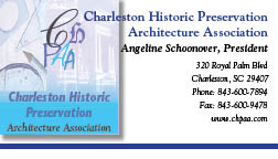
This is a business card I created for a fictional architecture & and preservation firm located in charleston.
I was to create a logo and a compelling layout.
I created a brightly colored logo that incorporated the firms abbreviation with pictures of an historic building and drafting equipment.
Also I created letterhead and envelope layout as well using technical spects to create a package which had a quality corporate identity for this firm.
Hollywood Deli Menu
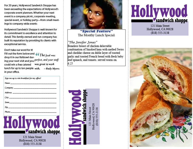 This is a menu created for a sandwich shop in hollywood California. The sandwich Shop created sandwiches with the names of Hollywoods best known stars.
The restaurant wanted a simple menu that would be low cost to print and would look good in black & white as well as color.
I included in this menu free pictures of the types of foods they sold. I also added a picture of the Hollywood star there featured monthly lunch special was named after.
This is a menu created for a sandwich shop in hollywood California. The sandwich Shop created sandwiches with the names of Hollywoods best known stars.
The restaurant wanted a simple menu that would be low cost to print and would look good in black & white as well as color.
I included in this menu free pictures of the types of foods they sold. I also added a picture of the Hollywood star there featured monthly lunch special was named after.
Sawdust Festival Poster
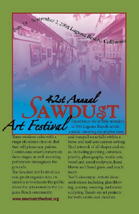 The Sawdust festival poster was created for this well known and long running arts festival in California.
For this project I was to create an eyecatching ad for the Laguna Beach Sawdust Festival using compelling visual elements.
I wanted to use colors from the events website in this poster as well as an actual pictures from the event and the event location.
The ad needed to fit a tabloid-size newspaper page and a second version of the same ad to fit a magazine trim size.
This Poster uses a number of great In Design tool's. Using the colors from the events website I created a Gradient swatch Rectangle, to which I added an image.
Then I applied image effects and transparency controls to add dimension and depth.
I also applyed diffrent blending modes so the objects blended smoothly into underlying objects.
I created wavy text by flowing text on a path. This ad needed to have relevant information but artistic so that the ad could be repurposed for festival souvenirs like shirts, and posters.
For this ad I presented the client's information in a clear format while using large graphic elements, font styles and text sizes which would grab the viewer's attention.
The Sawdust festival poster was created for this well known and long running arts festival in California.
For this project I was to create an eyecatching ad for the Laguna Beach Sawdust Festival using compelling visual elements.
I wanted to use colors from the events website in this poster as well as an actual pictures from the event and the event location.
The ad needed to fit a tabloid-size newspaper page and a second version of the same ad to fit a magazine trim size.
This Poster uses a number of great In Design tool's. Using the colors from the events website I created a Gradient swatch Rectangle, to which I added an image.
Then I applied image effects and transparency controls to add dimension and depth.
I also applyed diffrent blending modes so the objects blended smoothly into underlying objects.
I created wavy text by flowing text on a path. This ad needed to have relevant information but artistic so that the ad could be repurposed for festival souvenirs like shirts, and posters.
For this ad I presented the client's information in a clear format while using large graphic elements, font styles and text sizes which would grab the viewer's attention.
The Humane Society Wall Calender
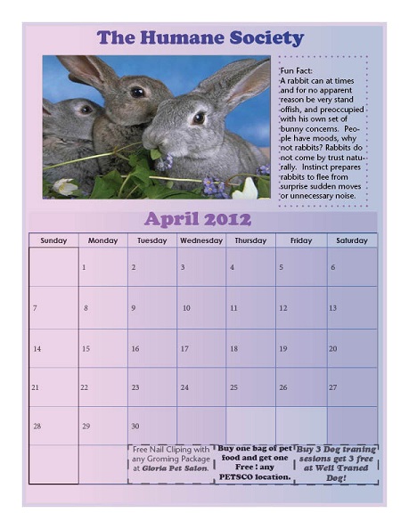 This is one month of a series of four created for a promotional calender for the Human Society's annual fundrasing drive.
The calender was to have each month on one sheet so it could be flipped.
I had to design a layout that incorporated the month grid, I Used the master page to build the basic structure of each page.
The organization wanted each month to feature a picture of one of the animals they helped, cute and cuddly images of happy pets to encorage adoption.
I was also required to include 3 coupons for three different local business that donor companys could feature pet related coupons.
The Humane Society also wanted me to include a monthly 'fun fact'about each months featured animals.
I decided to select animals for the months that we're commonly associated with that particular month already likewise for the colors I select for each layout. Using the colors the months holiday colors I created a Gradient swatch Rectangle for the background layout.
Then I applied image effects and transparency controls to add dimension and depth.
This is one month of a series of four created for a promotional calender for the Human Society's annual fundrasing drive.
The calender was to have each month on one sheet so it could be flipped.
I had to design a layout that incorporated the month grid, I Used the master page to build the basic structure of each page.
The organization wanted each month to feature a picture of one of the animals they helped, cute and cuddly images of happy pets to encorage adoption.
I was also required to include 3 coupons for three different local business that donor companys could feature pet related coupons.
The Humane Society also wanted me to include a monthly 'fun fact'about each months featured animals.
I decided to select animals for the months that we're commonly associated with that particular month already likewise for the colors I select for each layout. Using the colors the months holiday colors I created a Gradient swatch Rectangle for the background layout.
Then I applied image effects and transparency controls to add dimension and depth.
Exchange Arts Poster
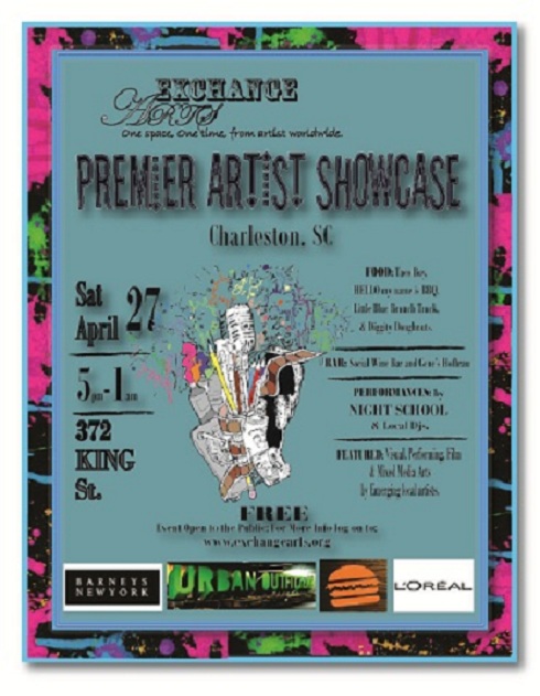 This is a poster I created for a fictional nonprofit arts organization called Exchange Arts.
This poster was apart of a project for my Advanced Arts Managment class.
The purpose of this poster was to promote the organizations first event: the Premier Arts Showcase.
Because this event is for an arts event that will be showcasing visual, sculptural, musical, performing and film arts.
I wanted to create a special custom image which would tools/ elements used in the creation of all of these types of art.
I drew the image out with pen and paper, I then scaned it, manipulated it in Photoshop then added I to the base poster I created in In Design.
For the basic layout of the poster, I wanted to create a brightly colored, attention grabing design that world be easy for the viewer to read.
So I created a wordmark for the organization and selected an eye catching font for the title and the information about the event.
I decided to include the who, what, where, when & how much and only adding the organizations website to the poster.
This is a poster I created for a fictional nonprofit arts organization called Exchange Arts.
This poster was apart of a project for my Advanced Arts Managment class.
The purpose of this poster was to promote the organizations first event: the Premier Arts Showcase.
Because this event is for an arts event that will be showcasing visual, sculptural, musical, performing and film arts.
I wanted to create a special custom image which would tools/ elements used in the creation of all of these types of art.
I drew the image out with pen and paper, I then scaned it, manipulated it in Photoshop then added I to the base poster I created in In Design.
For the basic layout of the poster, I wanted to create a brightly colored, attention grabing design that world be easy for the viewer to read.
So I created a wordmark for the organization and selected an eye catching font for the title and the information about the event.
I decided to include the who, what, where, when & how much and only adding the organizations website to the poster.